
Faces
Checkout Redesign

View Case Study
.png)
Team:
ROLE:
Company:
Tanagra is a luxury homeware brand, based in the UAE, Saudi Arabia, Kuwait and Qatar, with an online store. They offer products from brands such as Dolce &Gabbana, Casa, Christofle, Versace and many more.
The company wanted to increase sales by making it easier for customers who lead busy lifestyles, spending most of their time away from home, to not worry about erratic and unpredictable delivery times.
The Click & Collect feature allows customers to buy items from the online store and pick them up in person. This allows users to pay online and choose a convenient time to collect their purchase.


To explore our target audience, I interviewed individuals who shop at luxury retail stores, who have past orders with Tanagra and users who exited the checkout flow. Our target user is a compilation of the data collected and her name is Lena:

Goal: Find and buy a gift for her anniversary because she has very little free time.

Users don’t want to visit a crowded store and be in contact with a large group of customers.
User’s want their purchased items immediately and can’t wait till the expected delivery date.
Users don’t want to wait for in store assistance or pay a delivery fee for items they want as soon as possible.

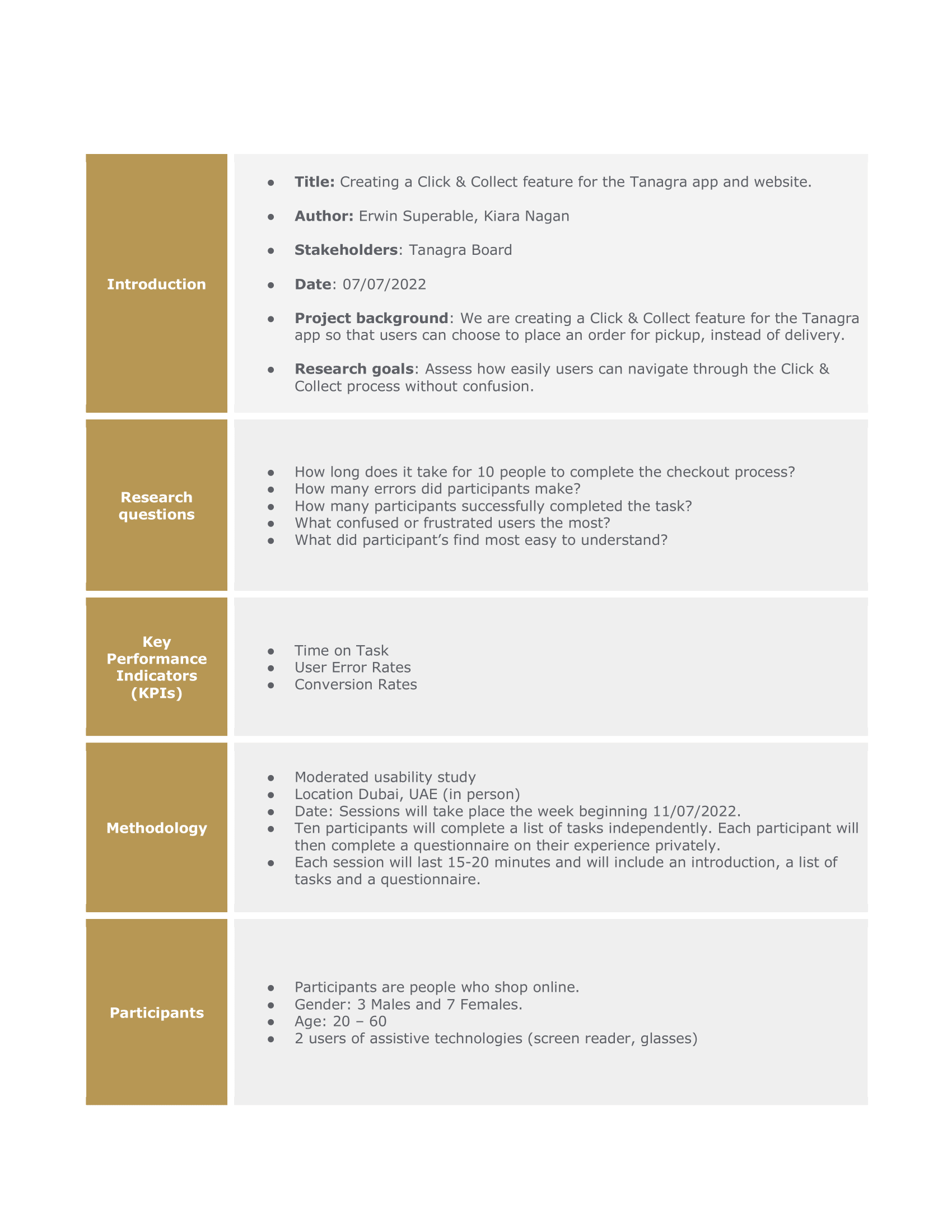
Using the wireframes we carried out a series of usability tests. We wanted to test the functionality of the feature as well as the comprehension the task. To quantify our results we measured the time on task, user error rate as well as the conversion rate. These tests exhibited the main pain points users experienced.

.jpeg)
Users were confused by this step because it reduced the main advantage of Click & Collect; flexibility.
“This is annoying. I don’t know which date I’ll pick it up - I thought I could go at any time.”
Users wanted to know where their location was in relation to the store, so they could identify areas.
“I have no clue where this mall is but somehow it’s closest to me? Where is this?”
Users mistook the customer details section for the payment information, and were confused by the wording.
“Hmm what do you mean who’s collecting? Obviously I am.”


For 3 to 6 months following the launch of the Collection feature our team will review conversion rates(CVR), average order value(AOV) and units per transaction(UPT). Based on our findings we will decide whether it will be beneficial to include a split shipment feature, allowing users to checkout items for delivery and collection at once.
Due to the timeline of the project the amount of research done was limited. I would have like to conduct a second round of usability tests and potentially an A/B test. However the research we prioritised was a good choice because we were able to establish a persona that guided us to our initial pain points.

.png)