.png)
Tanagra
Click & Collect

View Case Study

Team:
ROLE:
Company:
Faces is the leading beauty omni-retailer with the latest fragrance, skincare, bath and body, makeup, haircare, and accessories in the region. With 85 stores across 9 countries (UAE, Kuwait, Saudi Arabia, Egypt, Lebanon, Qatar etc.) they offer products from top brands such as Yves Saint Laurent, Dior and Estee Lauder.
To enhance the user experience and provide more product options, the brand decided to incorporate a marketplace into its existing e-commerce website. However, integrating a marketplace into the checkout process can be a complex and challenging task, especially when it comes to maintaining a smooth and efficient user experience.
This case study focuses on the redesign of the checkout process for the Faces website to include a marketplace. The objective of the redesign was to create a seamless and intuitive user experience that would allow customers to easily purchase products from multiple sellers in a single transaction.
The project involved a collaborative effort between the UX design team, the development team, and the marketplace vendors to ensure that the checkout process was optimized for both the users and the sellers. The end goal was to create a checkout process that would increase sales and provide a competitive advantage in the beauty and cosmetics market.
In this case study, we will outline the research, design, and development process for integrating a marketplace into the checkout process of the Faces e-commerce website. We will discuss the challenges we faced and the solutions we implemented to create a user-friendly and efficient checkout process. We will also share the results of the project, including the impact on conversion rates and user satisfaction.
By sharing our experience with the Faces project, we hope to provide insights and best practices for designers and developers who are looking to integrate a marketplace into their existing checkout process for e-commerce websites in the beauty and cosmetics industry.

The objective of this A/B test was to compare the user experience of a single page checkout versus a multi-page checkout. The hypothesis was that a single page checkout would be more user-friendly and lead to higher conversion rates.
The test was conducted with a randomized sample of users, half of whom were shown the single page checkout and the other half were shown the multi-page checkout. The test was run for a period of two weeks to collect sufficient data.
After analyzing the data, the results suggest that the single page checkout had a slightly higher conversion rate than the multi-page checkout. While the difference was not large enough to be statistically significant, it may still indicate a preference among users for a more streamlined checkout process.
Overall, the test highlights the importance of conducting A/B tests to inform UX design decisions and shows that even small differences in user experience can have an impact on conversion rates. This information can be used to optimize the checkout process and improve the overall user experience for customers.
Aside from the numerical data collected during the A/B tests, we also observed the users actions and noted all verbal feedback. From these observations the following 3 points led to the choice of the single=page checkout:
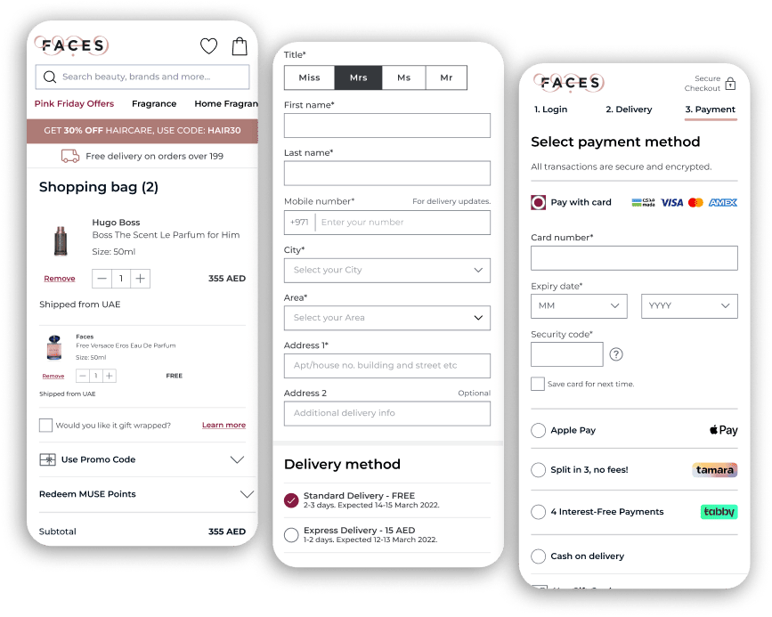
Users want to know the different locations their items are coming from.
Users want to know where their items are coming from and how that affects the price.
Users want to choose their payment type and visually see the differences.


Following the redesign of the checkout process to include a marketplace, unmoderated usability tests were conducted using UserZoom. The overall feedback from the participants was positive, with many noting that the checkout process was more streamlined and intuitive compared to the previous design.
Participants praised the clear and concise information provided during the checkout process, as well as the ability to easily navigate between different products and sellers. They also appreciated the option to add products to their cart from multiple sellers and complete the purchase in a single transaction.
However, the only criticism that was consistent among the participants was the lack of a way to track an order. Participants expressed the need for a tracking system that would allow them to monitor the progress of their order and know when it would be delivered.
Overall, the feedback from the unmoderated usability tests was positive, with participants noting that the checkout process was efficient, easy to use, and improved their overall shopping experience. The inclusion of a tracking system for orders was the only significant suggestion for improvement, and it would be important to implement in order to meet customer expectations and improve the overall user experience.

.png)